#WL8 Feature request:
The out of the box rotation strategy is quite nice. I didn’t realize in was packaged into WL8 until I attended a webinar.
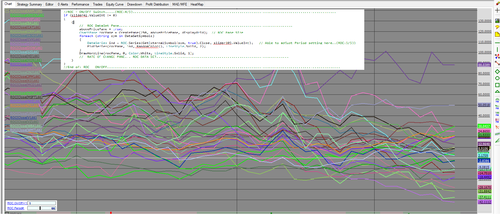
Knowing the WL program has a great handle of the data, I still like to be able to visualize the indicators with charting details as well. That said I keep going back to v6.9 to be able to visualize the top 3, Highest Weight value “ROC” in the dataset.
Anyone else see a benefit in adding a visualizer to see the dataset rotation in the rotation strategy? If, so give this a feature request a like.
On/Off Parameter for a dataset rotation pane in the Rotation Strategy chart tab.
(See WLv6.9 ROC pane Example attached.)
Rename
So "Visualizer" or "Chart Pane", these are entirely different concepts? Rotation strategies can be coded directly, you can plot all kind of series in a ChartPane there.
"Can Rotation strategies be tweaked like add a filter or use a custom indicator?"
https://www.wealth-lab.com/Support/Faq
"Can Rotation strategies be tweaked like add a filter or use a custom indicator?"
https://www.wealth-lab.com/Support/Faq
We can flag this as a #FeartureRequest. In WL8, Visualizers can be flagged to specific Strategy types, to technically it would be possible to create a "Rotation-only" Visualizer tab, which would show you how the symbols go up and down in rank like this. Would be quite interesting!
I've started working on this for Build 10.
I like the idea of a visualizer for rankings, but I've tried to do the same thing with mixed results. The problem is the ranking metric has so much volatility that it's useless. Running the analysis with "weekly" bars helps, but a visualization of the ranking metric still has too much volatility to be useful. And this is with managed mutual funds; imagine what stocks would look like.
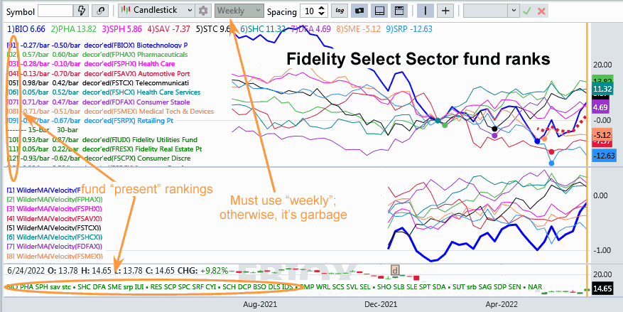
The visualizer below ranks Fidelity Select Sector funds by a complex "improvement" ranking metric. It basically computes a "dip recovery" of the funds and ranks on that. It then lists the funds in ranking order for the "present day". I wish I could build a visualizer that could do better that this, but the ranking metric is just too volatile. What I've done instead is plot the decorrelated line (decorrelated with the S&P500) of the highest ranking funds. And picking the best funds to buy from that visualization is still difficult on the weekly scale. Can you do it?

The visualizer below ranks Fidelity Select Sector funds by a complex "improvement" ranking metric. It basically computes a "dip recovery" of the funds and ranks on that. It then lists the funds in ranking order for the "present day". I wish I could build a visualizer that could do better that this, but the ranking metric is just too volatile. What I've done instead is plot the decorrelated line (decorrelated with the S&P500) of the highest ranking funds. And picking the best funds to buy from that visualization is still difficult on the weekly scale. Can you do it?

Your Response
Post
Edit Post
Login is required