There is this wonderful result visualizer "Position Metrics"
I have some suggestions to make it even more useful.
Better Average Line
Often I see nonlinear dependencies like in this image:
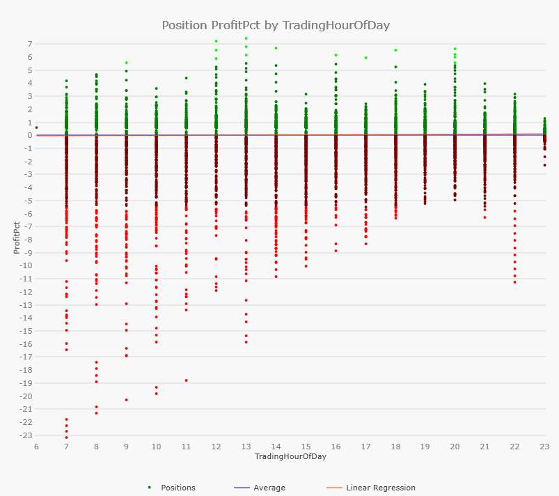
The blue line (constant overall average) doesn't help much, nor does the red line (overall linear regression)
Instead I suggest some "moving average" which connects the averages of the bins (average of all dots for Trading Hour 7, then average of all dots for trading hour 8, and so on)
This averaging should take care to use at least 100 dots for each average, probably by summing up several bins.
I have some suggestions to make it even more useful.
Better Average Line
Often I see nonlinear dependencies like in this image:
The blue line (constant overall average) doesn't help much, nor does the red line (overall linear regression)
Instead I suggest some "moving average" which connects the averages of the bins (average of all dots for Trading Hour 7, then average of all dots for trading hour 8, and so on)
This averaging should take care to use at least 100 dots for each average, probably by summing up several bins.
Rename
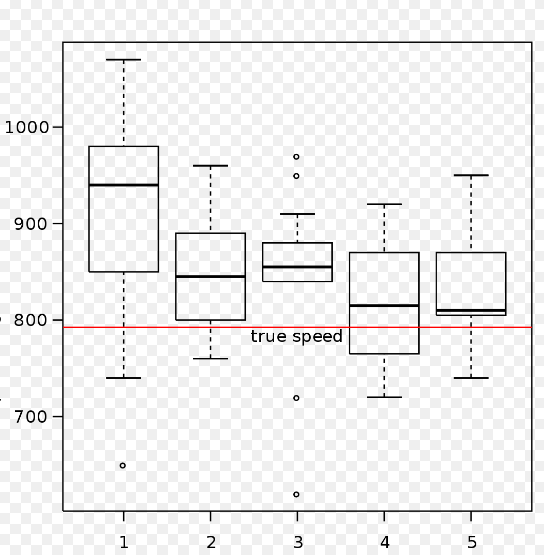
Having experimented with the 'smart' average, my thinking is we could better display a Median line.
CODE:Yes, the median Percentile(50) is better than the mean.
better display a Median line
The Interquartiles Percentile(25) and Percentile(75) are better than some standard deviation.
And finally Percentile(95) and Percentile(5) are better than Minimum /Maximum.
If I had a free wish, I wished all of these, you may choose the colors... ;)
Data visualizers developed over the years the very helpful Whisker-Plot
(https://de.wikipedia.org/wiki/Box-Plot).
Probably this inspires you...
(https://de.wikipedia.org/wiki/Box-Plot).
Probably this inspires you...
Median added in B34.
Your Response
Post
Edit Post
Login is required