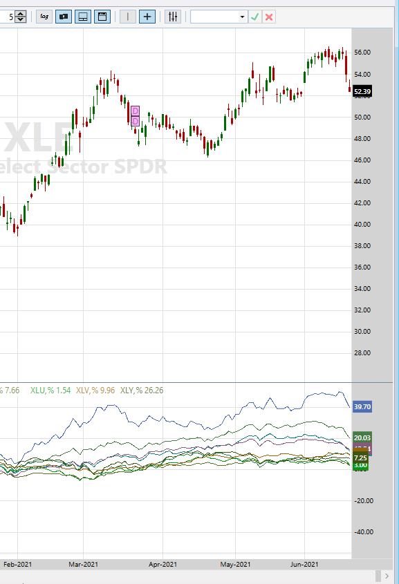
I like to plot Relative Performance of a bunch of symbols simultaneously, see pic below (its for Select Sector ETFs).
The right edge often gets crowded making it hard to identify individual plots. While one can highlight a particular plot by moving the mouse cursor over it, it would be nice if this is accompanied by highlighting of its description as well making it easier to identify which symbol's it is.
Not urgent, but.......
Rename
Makes sense, has my vote!
Completed for Build 12.
👍
Using build 12.
Thanks for your quick attention to this matter!
While it is awfully nice to have the right margin value brought to the forefront, I'd actually hoped that the plot description gets to stand out simultaneously with highlighting the series:
As now:
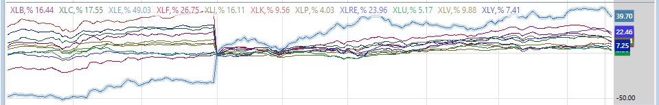
Series is highlighted but its still difficult to figure out which symbol it is.
Hoping for {pardon my poor editing capabilities!}:
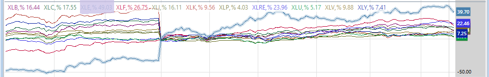
In the edited pic above the Series description is also highlighted.
Ways to make the description stand out:
- Bold & underline the text (probably the best)
- Bold only
- Underline only
- Highlight the background (but then issue will arise: which color to use?)
- Blink; if the above items can't be done easily then this may suffice (though it'll only last a few seconds)
Thanks for your quick attention to this matter!
While it is awfully nice to have the right margin value brought to the forefront, I'd actually hoped that the plot description gets to stand out simultaneously with highlighting the series:
As now:
Series is highlighted but its still difficult to figure out which symbol it is.
Hoping for {pardon my poor editing capabilities!}:
In the edited pic above the Series description is also highlighted.
Ways to make the description stand out:
- Bold & underline the text (probably the best)
- Bold only
- Underline only
- Highlight the background (but then issue will arise: which color to use?)
- Blink; if the above items can't be done easily then this may suffice (though it'll only last a few seconds)
OK I will re-activate this request then.
@Glitch,
The highlighting of the timeseries has come in very handy, I use it practically everyday.
But there's a limitation (and a suggested solution). Consider this screenshot of 6-month ROC of the current Naz-100 components:
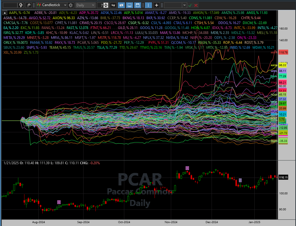
There is a dense clustering of the series & values, as you can see. It's extremely time-consuming - and sometimes impossible - to tease out a particular series one is interested in.
Would it be possible for you to add code so that left-clicking or hovering the mouse over the symbol/description would highlight the corresponding series and also bring its value to the forefront (just as it happens currently by highlighting the series)?
This would:
- Complement existing functionality: One could either highlight the series to see the corresponding symbol/description OR highlight the symbol/description to see the corresponding series (the right-edge value should pop to the forefront, no matter which method is used)
- Make it super easy to highlight whichever specific symbol one is interested in rather than go hit-or-miss
[If implemented, you may wish to add a slight delay (0.5-1 second?) so a simple mouse motion across the screen won't highlight everything in the path.]
The highlighting of the timeseries has come in very handy, I use it practically everyday.
But there's a limitation (and a suggested solution). Consider this screenshot of 6-month ROC of the current Naz-100 components:
There is a dense clustering of the series & values, as you can see. It's extremely time-consuming - and sometimes impossible - to tease out a particular series one is interested in.
Would it be possible for you to add code so that left-clicking or hovering the mouse over the symbol/description would highlight the corresponding series and also bring its value to the forefront (just as it happens currently by highlighting the series)?
This would:
- Complement existing functionality: One could either highlight the series to see the corresponding symbol/description OR highlight the symbol/description to see the corresponding series (the right-edge value should pop to the forefront, no matter which method is used)
- Make it super easy to highlight whichever specific symbol one is interested in rather than go hit-or-miss
[If implemented, you may wish to add a slight delay (0.5-1 second?) so a simple mouse motion across the screen won't highlight everything in the path.]
@Glitch,
The code already exists, just needs a tweak to add the requested functionality. Hope you can find the time to do this soon.
The code already exists, just needs a tweak to add the requested functionality. Hope you can find the time to do this soon.
Your Response
Post
Edit Post
Login is required