Easier Out-of-Sample Testing
Noise Optimization - generate noise altered and resampled timeseries
Monte Carlo Visualizer
* simulations tab
- can you graph logarithmically
* analysis tab
- can you add baseline to the monte carlo analysis graph
* new tab
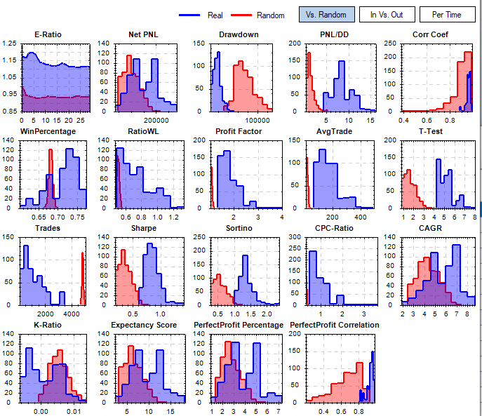
- grid of charts showing the distribution of metrics vs random
Noise Optimization - generate noise altered and resampled timeseries
Monte Carlo Visualizer
* simulations tab
- can you graph logarithmically
* analysis tab
- can you add baseline to the monte carlo analysis graph
* new tab
- grid of charts showing the distribution of metrics vs random
Rename
In-sample vs Out-of-sample
Umm, this might need some explanation or context?
Yes, there needs to be more explanation here. It looks like it might be a scatter plot of residuals. But if that's true, what's the model that we are testing against? What are the units (or identity) of the axes?
For example, let's take the WinPercentage scatter plot. I've guessing WinPercentage is on the y-axis (right?), but then what's on the x-axis?
I just don't get it. At any rate, I think the answer is the use ScottPlot to make these plots. And ScottPlot will do some regression fitting as well. https://scottplot.net/cookbook/4.1/category/statistics/#linear-regression
The big picture thought is to see if your strategy outperforms a random generated set of results. Indicating that your strategy has some merit beyond just luck. The first graph blue histogram is your strategy run against a random set of timeseries (could just be a re-sampling of the real timeseries). The red histogram is a set of randomly generated strategies using the same conditions run against the same randomly generated timeseries from the blue histogram. Not all of these metrics will outperform the random set but the ones that you optimized for should definitely outperform the random set. The first chart is one way to implement this test but there are a lot of ways to go with this depending on the situation.
If you have the book:
https://www.amazon.com/Hedge-Fund-Market-Wizards-Winning-ebook/dp/B007YGGOVM/ref=sr_1_5?keywords=hedge+fund&qid=1638975842&sr=8-5
Chapter 5 by Jaffray Piers Woodriff of Quantitative Investment Management discusses this element of how they implement this type of test in their data mining for strategies.
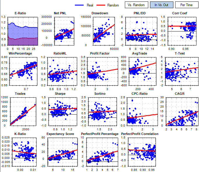
The second set of charts is based on the same data as above but are comparing in-sample vs out-of-sample periods and putting a linear regression line through those metrics.
This gives you a quick visual way to see how your strategy performs on the out-of-sample portion.
If you have the book:
https://www.amazon.com/Hedge-Fund-Market-Wizards-Winning-ebook/dp/B007YGGOVM/ref=sr_1_5?keywords=hedge+fund&qid=1638975842&sr=8-5
Chapter 5 by Jaffray Piers Woodriff of Quantitative Investment Management discusses this element of how they implement this type of test in their data mining for strategies.
The second set of charts is based on the same data as above but are comparing in-sample vs out-of-sample periods and putting a linear regression line through those metrics.
This gives you a quick visual way to see how your strategy performs on the out-of-sample portion.
The noise test is randomizing the OHLC of a timeseries and seeing how the strategy performs. You can have an input of say 10-40% variation for each point and see how the strategy performs.
The In-sample vs. Out-of-sample plots shown in MJJ3’s second post require the following scenario:
Instead of a single backtest interval of say 10 years we divide the historical backtest interval into two parts: In-sample (IS, say 5 years) and Out-of-Sample (OS, the other five years).
The idea behind this: use the In-sample data for all strategy developments, check changes in code, optimizations. After you finished the strategy development process you test on the Out-of-Sample data which was not used to adapt the strategy in any way, thus it is “unseen” data.
For this approach to work you should know what your performance metrics do if you switch from In-sample data to Out-of-Sample data, i.e. asses the predictive power of your performance metrics.
In order to gauge the quality of a performance metric we run several backtests on In-sample data and on Out-of-sample data and compare the values of all the performance metrics for these two runs.
If we run many “splitted” backtests this way we can “measure” the quality of a performance metric by creating a scatterplot:
The X-Axis is used for the In-Sample value of the metric, the Y-Axis is used for the Out-of-sample value of that metric. Each single backtest will generate one data point. We repeat for many different trading strategies or variants thereof.
If we have a perfect metric with perfect predictive power this will form a straight line in the scatter plot:
Low values of our metric in In-sample data will correspond with low values for the same metric on Out-of sample data, high IS values will correspond to high OS values.
A less perfect metric will create a more “cloudy” picture.
If you review the graphs in mjj3’s post you’ll see that only the “Trades” metric is really good.
Now the good news: It is possible to create all these plots with Wealth-Lab-7, here’s how:
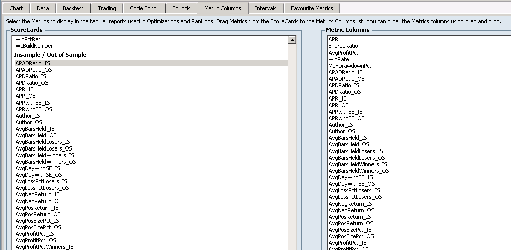
Go to Preferences->Metric Columns.
Select all available metrics from the Insample / Out of Sample Scorecard. (available from the finantic.ScoreCard extension):
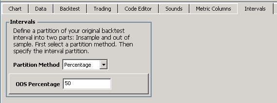
Go to Preferences->Intervals (also part of the finantic.ScoreCard extension) and select the partition method Percentage and an OOS percentage of 50%. This defines our historical IS and OS intervals:
Now open a strategy of your choice which has a set of optimizable parameters.
Make sure the DataRange is about 10 years of data in Strategy Settings.
Go to the Optimize Window. Select the Optimization Method “Random Search” (availbale form the finantic.Optimizer Extension). Open Configure Optimization Method and select 1000 iterations.
Start the optimization, this will take a while.
Please note, the optimizer is not used to optimize anything here. It is just used to create a large number of different backtests with an equally large number of different performance reports with all their different metric values.
After optimization has finished open the Correlation Optimization Visualizer. (available from the finantic.Optimizer extension)
Select the Mode IS/OS. This will restrict the calculated and displayed correlations to the IS/OS pairs of metrics.
Select the “Best” tab and click on the “Robust” column header. This will sort all correlations and show the best values at the top:
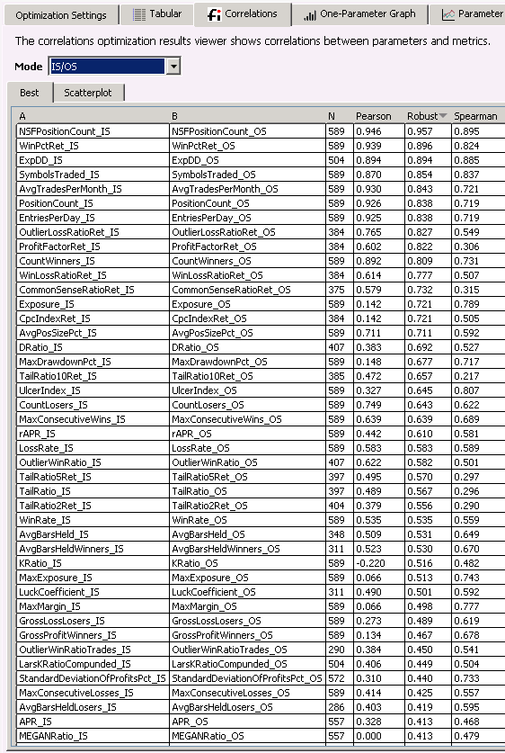
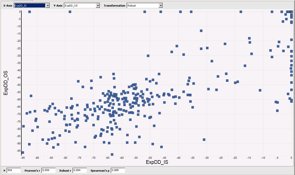
Besides obvious metrics like “Position Count” there is among the best metrics “ExpDD” (Expected Drawdown), a metric available form the “SysQ and ExpDD” extension. Here the Scatterplot of this metric:
Of course you now can create Scatterplots for all the other metrics like we did for ExpDD.
Instead of a single backtest interval of say 10 years we divide the historical backtest interval into two parts: In-sample (IS, say 5 years) and Out-of-Sample (OS, the other five years).
The idea behind this: use the In-sample data for all strategy developments, check changes in code, optimizations. After you finished the strategy development process you test on the Out-of-Sample data which was not used to adapt the strategy in any way, thus it is “unseen” data.
For this approach to work you should know what your performance metrics do if you switch from In-sample data to Out-of-Sample data, i.e. asses the predictive power of your performance metrics.
In order to gauge the quality of a performance metric we run several backtests on In-sample data and on Out-of-sample data and compare the values of all the performance metrics for these two runs.
If we run many “splitted” backtests this way we can “measure” the quality of a performance metric by creating a scatterplot:
The X-Axis is used for the In-Sample value of the metric, the Y-Axis is used for the Out-of-sample value of that metric. Each single backtest will generate one data point. We repeat for many different trading strategies or variants thereof.
If we have a perfect metric with perfect predictive power this will form a straight line in the scatter plot:
Low values of our metric in In-sample data will correspond with low values for the same metric on Out-of sample data, high IS values will correspond to high OS values.
A less perfect metric will create a more “cloudy” picture.
If you review the graphs in mjj3’s post you’ll see that only the “Trades” metric is really good.
Now the good news: It is possible to create all these plots with Wealth-Lab-7, here’s how:
Go to Preferences->Metric Columns.
Select all available metrics from the Insample / Out of Sample Scorecard. (available from the finantic.ScoreCard extension):
Go to Preferences->Intervals (also part of the finantic.ScoreCard extension) and select the partition method Percentage and an OOS percentage of 50%. This defines our historical IS and OS intervals:
Now open a strategy of your choice which has a set of optimizable parameters.
Make sure the DataRange is about 10 years of data in Strategy Settings.
Go to the Optimize Window. Select the Optimization Method “Random Search” (availbale form the finantic.Optimizer Extension). Open Configure Optimization Method and select 1000 iterations.
Start the optimization, this will take a while.
Please note, the optimizer is not used to optimize anything here. It is just used to create a large number of different backtests with an equally large number of different performance reports with all their different metric values.
After optimization has finished open the Correlation Optimization Visualizer. (available from the finantic.Optimizer extension)
Select the Mode IS/OS. This will restrict the calculated and displayed correlations to the IS/OS pairs of metrics.
Select the “Best” tab and click on the “Robust” column header. This will sort all correlations and show the best values at the top:
Besides obvious metrics like “Position Count” there is among the best metrics “ExpDD” (Expected Drawdown), a metric available form the “SysQ and ExpDD” extension. Here the Scatterplot of this metric:
Of course you now can create Scatterplots for all the other metrics like we did for ExpDD.
Here is the Scatterplot for APR:
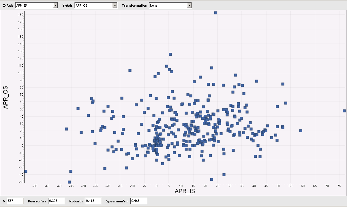
APR is among the most widely used metrics during strategy development. The Scatterplot above shows, that it is a really bad metrics because it has virtually no predictive power.
This means: If you optimize your strategy for high APR values, it will almost certainly break down in realtime trading.
APR is among the most widely used metrics during strategy development. The Scatterplot above shows, that it is a really bad metrics because it has virtually no predictive power.
This means: If you optimize your strategy for high APR values, it will almost certainly break down in realtime trading.
Thank you very much for your explanation. That does clarify what I'm seeing here.
I also see that WinPercentage is somewhat linear, but it has a larger random cloud than the Trades scatter plot.
The bad news is that optimizing by Trades is not going to earn you more money. However, optimizing by WinPercentage might.
But the real conclusion here is that none of the ScoreCard metrics seem very predictive (at least for this strategy under test). I'm wondering how to fix that, but I suppose that's another topic.
I don't want to start a new topic here, but the fundamental problem is WL is confounding the Buy behavior with the Sell behavior, when these two behaviors need to be analyzed independently "initially" during the strategy development process. Post development, these two behaviors can--and should--then be analyzed together. But you probably already knew that.
QUOTE:
If we have a perfect metric with perfect predictive power this will form a straight line in the scatter plot:
Low values of our metric in In-sample data will correspond with low values for the same metric on Out-of sample data, high IS values will correspond to high OS values.
A less perfect metric will create a more “cloudy” picture.
If you review the graphs in mjj3’s post you’ll see that only the “Trades” metric is really good.
I also see that WinPercentage is somewhat linear, but it has a larger random cloud than the Trades scatter plot.
The bad news is that optimizing by Trades is not going to earn you more money. However, optimizing by WinPercentage might.
But the real conclusion here is that none of the ScoreCard metrics seem very predictive (at least for this strategy under test). I'm wondering how to fix that, but I suppose that's another topic.
I don't want to start a new topic here, but the fundamental problem is WL is confounding the Buy behavior with the Sell behavior, when these two behaviors need to be analyzed independently "initially" during the strategy development process. Post development, these two behaviors can--and should--then be analyzed together. But you probably already knew that.
Your Response
Post
Edit Post
Login is required