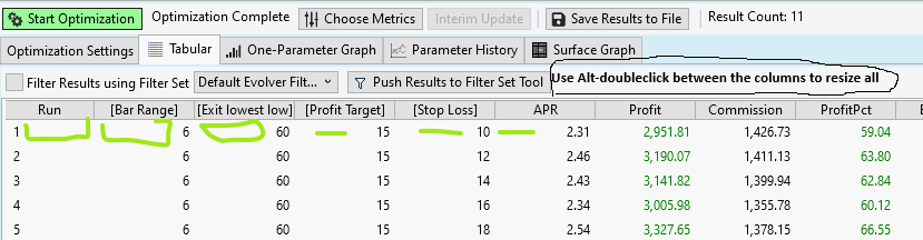
When you double-click between 2 columns, it will adjust the size of the column as small as possible according to the text in the header.(adjusted)
(Original: Just as in excel, when you double-click between 2 columns, it will adjust the size of the column as small as possible according to the text in the header.)
When the columns are auto-sized there is much more info to see without the need to use the scroll bar below. Even then, you'll miss the left part.
So, why the columns not auto-size automatically, so you don't have to click them ALL, EACH TIME.
See the difference:
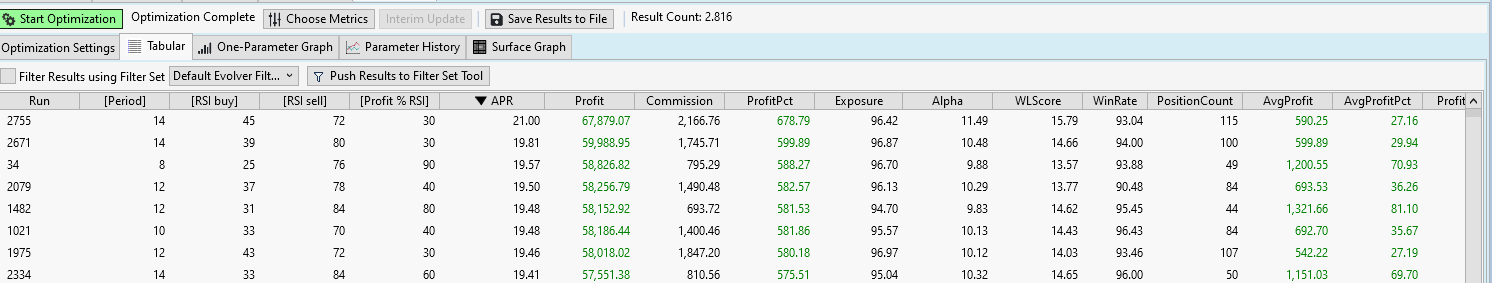
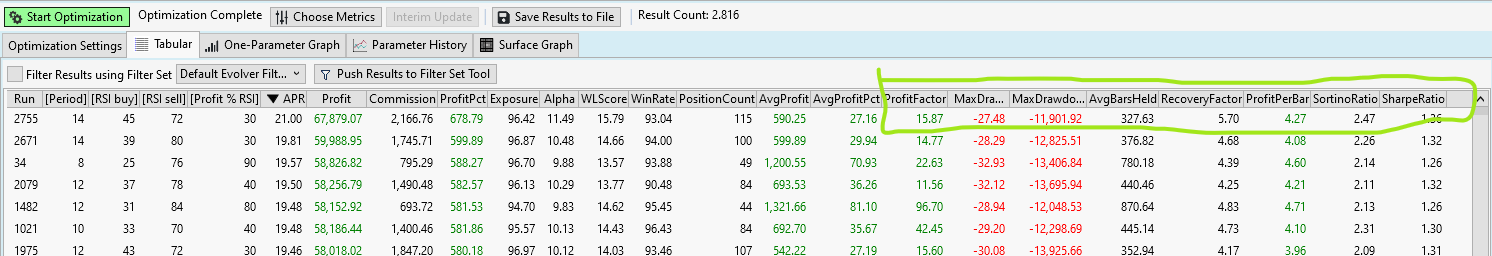
If the use of "drawdown" is shortened to "DD" that will also help.
#usability
It is your forum, it's your site but wouldn't it be more appropriate to :
1. not change content of one's question.
2. not mark something immediately as best answer, the question owner can do this.
3. not select solved to soon. Wait a reply of the question owner..?
Many thanks.
(Original: Just as in excel, when you double-click between 2 columns, it will adjust the size of the column as small as possible according to the text in the header.)
When the columns are auto-sized there is much more info to see without the need to use the scroll bar below. Even then, you'll miss the left part.
So, why the columns not auto-size automatically, so you don't have to click them ALL, EACH TIME.
See the difference:
If the use of "drawdown" is shortened to "DD" that will also help.
#usability
It is your forum, it's your site but wouldn't it be more appropriate to :
1. not change content of one's question.
2. not mark something immediately as best answer, the question owner can do this.
3. not select solved to soon. Wait a reply of the question owner..?
Many thanks.
Rename
WL8 already auto-sizes the column width when you double click between the column headers. Are you not seeing this?
Indeed Glitch, I know. My phrase "Just as in excel, when you double-click between 2 columns, it will adjust the size of the column as small as possible according to the text in the header" was not clear.
This is better: "As in excel when you double-click in WL8 between 2 columns...."
BUT than you have to double-click on EACH column EVERYTIME, correct?
So, my request is to make this standard.
As you can notice on the images, you save a lot of space and can see more columns on the same screen size. I have already a 24 inch screen.
PS: it's kind of funny to see that the BEST ANSWER is choosen by the person who answered and also marked as SOLVED. While it's not.
I understand you wanna close problems asap ;-)
QUOTE:No, I marked Glitch's reply as such because it is true that a double click does that resize on a per column basis,
PS: it's kind of funny to see that the BEST ANSWER is choosen by the person who answered and also marked as SOLVED. While it's not.
WL is not Excel, it is based on different technology, and it's a moot point that we should blindly copy all peculiarities of the different software.
Eugene, it was to explain the feature (as analogy) that I mentioned Excel.
But, if you want - in excel - you can select all columns and double-click to resize them all together. That's already something.
It is not that WL should copy everything. You are free to cherry-pick the best things from all programs to make your own program better and better.
I would notice these kind of things when I daily use my own program. It's just about making things user-friendly.
If it is a lot of work, I can understand it's not worth it. And there are other priorities but maybe it is something to keep in mind when making something new with columns.
Anyway, a FeatureRequest will show if more people like this or not.
PS: isn't it the question owner who should accept 'best answer' ?
Of course your points are valid.
However, personally I prefer seeing things laid out on your top screenshot to the hoarding manner of the second one. The higher density of information, the cut off column names - both in fact withdraws from #usability. The user (especially a new one) would have to take an extra step resizing identically looking column names like MaxDra... in an attempt to understand the difference between them.
Next, we would have to add another checkbox on the Tabular's label strip or (God forbid) an option in Preferences just to manage the behavior. Isn't the WL GUI complex enough already to justify the new option?
I believe it's impractical to give them complete control of it as they can unsubscribe from the product, not visit the forum etc.
However, personally I prefer seeing things laid out on your top screenshot to the hoarding manner of the second one. The higher density of information, the cut off column names - both in fact withdraws from #usability. The user (especially a new one) would have to take an extra step resizing identically looking column names like MaxDra... in an attempt to understand the difference between them.
Next, we would have to add another checkbox on the Tabular's label strip or (God forbid) an option in Preferences just to manage the behavior. Isn't the WL GUI complex enough already to justify the new option?
QUOTE:
PS: isn't it the question owner who should accept 'best answer' ?
I believe it's impractical to give them complete control of it as they can unsubscribe from the product, not visit the forum etc.
Personally, I like the hoarding manner.
I think an Alt+Double Click could do the trick without adding GUI options.
I think an Alt+Double Click could do the trick without adding GUI options.
Eugene, the goal would be that all text is still readable.
There are some real lenghty names so my suggestion was to shorten DrawDown tot DD but that's minor thing.
I don't see the advantage of so much wasted space. Only the disadvantage, like not seeing much columns.
The idea of Cone: Alt-double click, can to do the trick.
Everybody can vote
There are some real lenghty names so my suggestion was to shorten DrawDown tot DD but that's minor thing.
I don't see the advantage of so much wasted space. Only the disadvantage, like not seeing much columns.
The idea of Cone: Alt-double click, can to do the trick.
Everybody can vote
QUOTE:
There are some real lenghty names so my suggestion was to shorten DrawDown tot DD but that's minor thing.
The metrics are loaded from various libraries, including 3rd party. Thus it'd be impractical to "postprocess" their names because of their dynamic nature.
QUOTE:
I don't see the advantage of so much wasted space.
The space is not "wasted", it's distributed in an aesthetically pleasing manner. This is also important to prevent the GUI and information overload. Unfortunately, it's hard to make people realize such ideas as the "consumerism" around us naturally asks us to request more and more.
It's not aesthetically pleasing to me. Empty space is provides no information.
In Excel, you don't even have to click. You can just add a macro module with this one-liner:
(It will be a bit harder to do in WealthLab.)
In Excel, you don't even have to click. You can just add a macro module with this one-liner:
CODE:
Sub AutoResizeColumns()
    ActiveSheet.UsedRange.Columns.AutoFit
End Sub
(It will be a bit harder to do in WealthLab.)
QUOTE:
Empty space is provides no information.
True. So if the market is closed on holidays should we be disappointed about the inability to make money or still enjoy some rest? So IMHO a bit of empty space lets the GUI keep the balance, reducing stress from the evident overload and hoarding on topic starter's 2nd screenshot.
This analogy has no meaning here.
I get it, you like the space. You can have your space, we'll remove ours when we don't want it.
I get it, you like the space. You can have your space, we'll remove ours when we don't want it.
Your Response
Post
Edit Post
Login is required