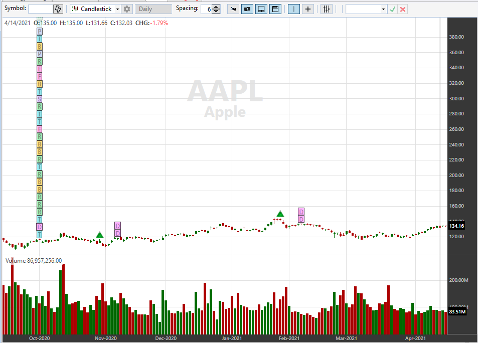
In WL6 one could choose which fundamental events to plot such as dividend, stock split, etc. In WL7 its all-or-none which is creating a lot of clutter and even altering the plot scale, see pic below. I would request the developers to make the choice more granular.
Rename
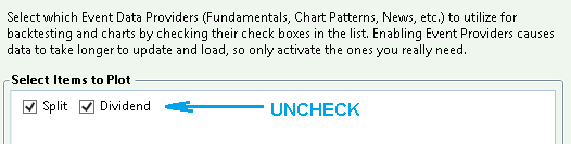
Fortunately, you can already select which Event items to plot. Please see Help > Data Manager > Event Providers > Controlling which Event Data is Plotted. It's a matter of unchecking an undesired event type.
Since we already have a request for reducing the icon clutter, this request is rejected.
https://www.wealth-lab.com/Discussion/Event-Icon-Reduction-and-Event-Numbers-5975
Since we already have a request for reducing the icon clutter, this request is rejected.
https://www.wealth-lab.com/Discussion/Event-Icon-Reduction-and-Event-Numbers-5975
A picture is worth a thousand words:
Changes to the chart are applied on the fly.
Changes to the chart are applied on the fly.
Ok, my bad...I thought the check boxes were for which of those items would be downloaded rather than plotted (it's the Data Manager after all).
But there's an issue: If I uncheck, say, Dividend from one provider it gets unchecked from ALL providers. Is there a way to plot one event from provider A, another event from provider B, and so on? One had this choice in WL6.
But there's an issue: If I uncheck, say, Dividend from one provider it gets unchecked from ALL providers. Is there a way to plot one event from provider A, another event from provider B, and so on? One had this choice in WL6.
Yes, an item gets unchecked for all providers. I see your point but this is not an issue, rather the design whether some may like it or not. With the new design we no longer have the multitude of items like say "Dividend (Yahoo)" or "Dividend (Wealth-Data)" which was a source of confusion for many users. Not any more with one "Dividend" item.
And should one source go down another checked (!) Event data provider will act as backup automatically. If an Event provider is unchecked, it won't be polled for data.
And should one source go down another checked (!) Event data provider will act as backup automatically. If an Event provider is unchecked, it won't be polled for data.
If you don't want to see Events from a Provider, uncheck the Provider itself. Each Event Provider introduces more latency anyway so it's good to enable only those you really need to use.
QUOTE:
And should one source go down another checked (!) Event data provider will act as backup automatically.
That's why I d/l from multiple providers (they are free so why not) but I don't like to plot them all. Personally, I trust M* the most but its fundamental data is often quite delayed so its more practical to use Yahoo.
Got it, well we have the Feature Request logged now so we’ll get to it as soon as it rises near the surface!
@Glitch,
You may need to make the Feature Request active, currently it's marked as Declined.
You may need to make the Feature Request active, currently it's marked as Declined.
@Glitch
Can the proposed selective plotting of an item cause more confusion? Is there a reason that it works like this?
I find Robert's idea encompassing and elegant:
https://www.wealth-lab.com/Discussion/Event-Icon-Reduction-and-Event-Numbers-5975
Can the proposed selective plotting of an item cause more confusion? Is there a reason that it works like this?
I find Robert's idea encompassing and elegant:
https://www.wealth-lab.com/Discussion/Event-Icon-Reduction-and-Event-Numbers-5975
I am all for reducing clutter. However, the icon also must show what item it is - such as D for dividend, S for split, etc. That way the user can quickly target the one that they want to check.
A happy medium would be to:
- preserve individual icons for *select* data points - dividend, split & earnings are the big 3 and its virtually universal practice to display them individually
- the other remaining fundamental items could be lumped together under, say, a F icon, news under N, analyst ratings under AR, and so on
- allow users to choose which provider's data points they choose to plot, just as in WL6
- finally, I would urge that the plot preferences should be under Preferences as in WL6; to have them under Data Manager (which is for downloading data) is confusing
Plotting is only one of the functions of selection. The other is enabling the event data for use in strategies and indicators.
And sure, the idea isn't to put all events into one. You'd group the same event and show the number that occurred. Look at your image, that would reduce your 30 or so events to maybe 6 or 7 icons, each of which would contain the data for all events of the same type.
And sure, the idea isn't to put all events into one. You'd group the same event and show the number that occurred. Look at your image, that would reduce your 30 or so events to maybe 6 or 7 icons, each of which would contain the data for all events of the same type.
QUOTE:
You'd group the same event...
The big 3 (earnings, dividend, split) can certainly be grouped from all subscribed providers into 3 item-specific icons with a badge showing the number, agreed.
Outside those 3, I think all fundamental icons (e,g, Return on Assets, Shares, etc etc) from all sources can be lumped into one icon.
And the remaining stuff - news, analyst ratings, etc can also be grouped from all providers into their item-specific icons.
All this will reduce the icon clutter yet provide appropriate information. Its a Win-Win!
I think we agree broadly.
Your Response
Post
Edit Post
Login is required