Hi Eugene,
In the Italian lab, I have seen an interesting tool for analysis trades sequence that we haven't in WLP/D.
The idea to study trades sequence is to help a trader to identify if it can be interesting to pyramiding the position size. See here the screen shot of how the Italian lab has implemented the visualizer.

To complete the trade sequence analysis, this is also interesting to have a visualizer to define when missing trades occur. Without this, It is complicated to know if you have missing trades because of the market conditions (crash, high volatility…) or if this can be a position sizing problem (too big sizing). This type of visualizer is available in NinjaTrader (name : amount of parallel trades) or in the Italian lab
Is it possible to add this feature in our best trading tool :-) ?
Size:
Color:
Hi Alexandre,
Thank you for your feature request.
I'm not familiar with the Trade Dependency tool and thus cannot evaluate its every option, especially certain parts of it like "Avg Trade After N Win/Loss" and "Exposure Sentence". Do you have any idea what they do? It's an interesting approach but at the moment we cannot consider coding a rival from the ground up. However, where it comes to modeling the winning/losing streaks, my understanding is that a good part of its feature set is already available to WL users through:
1. Monte Carlo Lab's Trade Randomization feature can be adjusted to match the win/loss sequence of the randomized trades to the trades in the raw trade list as well as maintain serial correlation.
2. With help of the
Trade Outcome and related PosSizers (Winning/losing streaks) you can vary the position size for consecutive winners/losers.
3. The Trades widget looks identical to the Trade Graphs | Trade Stability tab of Wealth-Lab.
The "
Streak Sequence" widget looks like a candidate for inclusion to the Trade Graphs. I put it on our todo list.
As for NT's "
Amount of Parallel Trades", I remember having built this performance visualizer several months ago. It didn't make it to the production build as I wasn't impressed with what it offers. But if you find this type of analysis useful, let me re-examine and possibly release it.
Size:
Color:
Thanks for your interest.
“Streak Sequence” and “Avg Trade After N Win/Loss” are linked together. Both will help you to adjust the right parameter in the Trade Outcome PosSizer.
The streak Sequence is working like a CumUp & CumDown of trades when the trades are profitable or not. More you have high value of CumUp sequences, more pyramiding sizing trades you can do. The idea of “Avg Trade After N Win/Loss” is to group CumUp/CumDown sequence and sum the profil/loss result. By this way, you can define when you can start your pyramiding position. Is it clear about the logic and what you can do with theses information ?
To take fully advantage of the “Avg Trade After N Win/Loss”, “Trade Outcome” need to integrate the possibility to start increment/decrement only after N trades and some others options like you have in the Italian Labs (see parameters in the screen shot upper to the “calculate progression” button.
For the “Exposure Sentence”, I need to have a deep look inside the help.
Regarding “Amount of parallel Trades”, this is a good additional visualizer for the following reasons. At this time in WLP/D, you know only the number of missing trades due to lack of capital. There is no simple way to know when this has occurred (Trades+ sheet give only trades taken into account the simulation). Because of that, you don’t know if this is just a problem with your sizing logic or only because of the market condition. To do this, you need to run your backtesting in Raw mode and in portfolio mode, export results and study it in Excel. If you add a visualizer of parallel trades and add an horizontal line linking to the number of trades taking into account, you will see if you are a lot of time under or upper this line. Thanks to that, you can see the time periods and look if it was a special market condition. Maybe, if you add also an additional information (volatility of the B&H indicator), you can see if your number of trades are sensitives. Do you see now advantages ?
Size:
Color:
Appreciate your feedback Alexandre. I'll work on it for the upcoming release of MS123 Visualizers.
QUOTE:
If you add a visualizer of parallel trades and add an horizontal line linking to the number of trades taking into account, you will see if you are a lot of time under or upper this line.
Good idea.
QUOTE:
The streak Sequence is working like a CumUp & CumDown of trades when the trades are profitable or not.
This is my understanding, too.
QUOTE:
The idea of “Avg Trade After N Win/Loss” is to group CumUp/CumDown sequence and sum the profil/loss result.
That makes it clear. Interesting. Let me see if I can make something out of it.
Size:
Color:
Thanks again Eugene.
Regarding "Exposure Sequence", this visualizer gives you the information how the multiplicator on your pyramiding is apply during the backtest.
This is a good additional information in my point of view to study how is applied your pyramiding logic. With this, you can better adjust also the "Trade outcome" PosSizer.
PS : Are you going also to update the "Trade Outcome" PosSizer in the next version ?
Size:
Color:
QUOTE:
PS : Are you going also to update the "Trade Outcome" PosSizer in the next version ?
Should I? It's considered feature complete.
QUOTE:
Regarding "Exposure Sequence", this visualizer gives you the information how the multiplicator on your pyramiding is apply during the backtest.
Thanks, I think we can skip this.
Size:
Color:
In the Italian Labs, the similar "Trade Outcome" PosSizer gives you the following features that we haven't :
- possibility to apply rules for Long only or Short only or Both trades
- define when to start the pyramiding (to offer the possibility to not pyramiding automatically after the first trade)
- multiply or sum factor of pyramiding
- possibility to skip a trade after X consecutive trades and renew factor or apply a different factor value for the next one
Size:
Color:
Pyramiding is the synonymous
PosSizer's task (which applies the sizing regardless of streaks) while
Trade Outcome is about exploiting the winning/losing streaks. I feel that adding the extra options like
"defer the pyramiding after Nth trade" or "
skip a trade after X consecutive trades" would only make it more error-prone due to added complexity. And when developing software we have to account for simplicity and maintainability.
QUOTE:
- possibility to apply rules for Long only or Short only or Both trades
That's an interesting idea, just tedious to add to this or that PosSizer on demand. Might a simple workaround be sufficient for your purpose: break the trading system in two parts, Long and Short, and test them separately?
Size:
Color:
Hi Eugene,
I understand you that you don't want to have a complex solution. But Wealth-Lab is the choice of advanced traders (see your homepage : Preferred analysis platform by expert traders ;-)). So we expect to have advanced options in some cases also :-).
The objective of the “Avg Trade After N Win/Loss” visualizer is to define especially when to start and to stop your pyramiding position logic. If you consider the advantage of the visualizer, you need to consider to implement advanced options in the appropriate PosSizer.
The workaroud for "possibility to apply rules for Long only or Short only or Both trades" can be a solution and offer flexibility to have a dedicated parameter to each type of trades. Good point Eugene !
Size:
Color:
Alexandre, I do appreciate your continuing effort.
At the risk of repeating, at this point I'm not convinced that the options like
"defer the pyramiding after Nth trade" or "
skip a trade after X consecutive trades" are more than fancy. Even being intuitive and simple, I doubt that "Trade Outcome" has a wide fan army to justify the creation of a version on steroids so to say.
And for "
multiply or sum factor of pyramiding", I think you can take the
Pyramiding PosSizer (also feature-complete).
After implementing your other scheduled requests like the Seasonality and Candidate Trades visualizers I plan to work on Trade Sequence analysis.
Size:
Color:
Alexandre, clarification is required:
QUOTE:
If you add a visualizer of parallel trades and add an horizontal line linking to the number of trades taking into account, you will see if you are a lot of time under or upper this line.
What did you mean in the highlighted fragment? If this is the total number of trades the system has generated over time (e.g. 200 trades) then it cannot be directly compared to the number of actual trades (e.g. 10 open positions) or candidate trades (e.g. 20 Alerts). On attached chart the latter is the
dark red line and the number of total trades is
in blue.
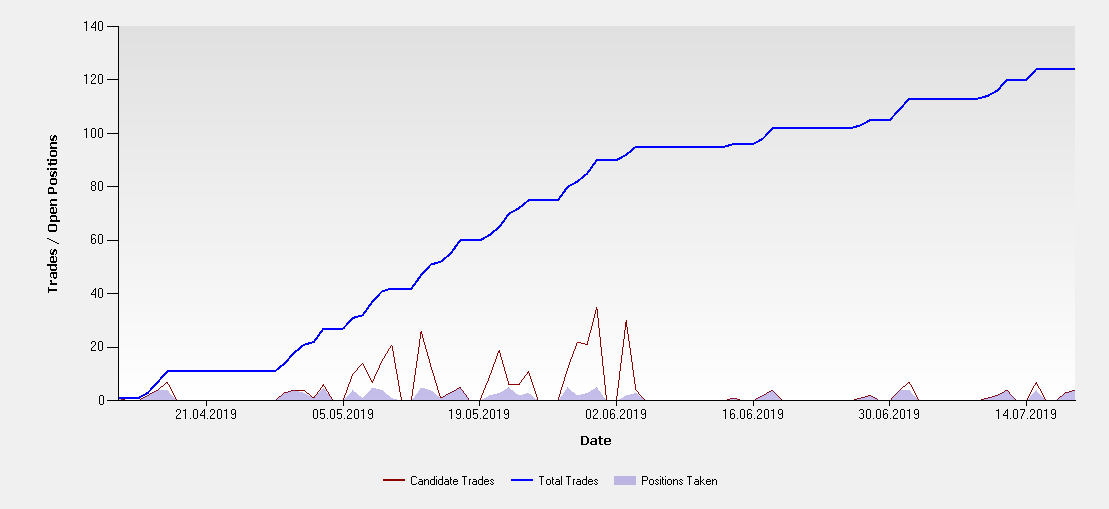
Let alone the inverse case - the
Superbands system in WealthSignals posts thousands of candidate signals daily which results in orders of magnitude less Positions taken.
Basically one of the lines should be above the other for the best part. Or was something else on your mind? I could assign the blue line (rolling trades) to Axis Y2 so it won't "dominate" the chart but this would make the comparison hard to impossible. Plotting the volatility of Buy&Hold (as suggested in your post #3) also doesn't bring much clarity (would look specific to my taste).
As is, this visualizer tab doesn't seem very attractive to me to qualify for inclusion.
Size:
Color:
Eugene,
I see your point regarding "Horizontal Line". This cannot be a simple line.
This is a complex concept (because it's linked to the Position Logic).
But I think we can have something more simple like this (see my Drawings).
The idea is to put on the top of the chart, bars chart to give you the number of entry signals of your strategy.
In the same part on the chart, another bars chart to give you the number of real entry position.
At the end in the same part of the chart, the line of the volatility of your B&H (index).
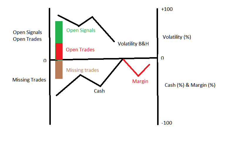
Under the chart, bars chart to give your the number of missing trades.
In this same part of the chart, the line gives you the percentage of your cash availability and the percentage of margin used.
If you consider this visualizer to complex to read/understand, maybe it can be splitted in two separates chart for the same visualizer sheet.
What do you think ?
Size:
Color:
Thank you Alexandre, your sketch is helpful. Now the idea starts to make better sense. Will let you know if I make something out of it.
(Offtopic) On a related note, in Wealth-Lab it's possible to overlay the Equity chart with Open Positions (the right-click menu) and Cash/Margin as well.
Size:
Color:
QUOTE:
in Wealth-Lab it's possible to overlay the Equity chart with Open Positions (the right-click menu)
Thanks, I didn't know that.
Size:
Color:
Sneak peek at MS123 Visualizers 2019.08:
1. Number of missed trades vs. Equity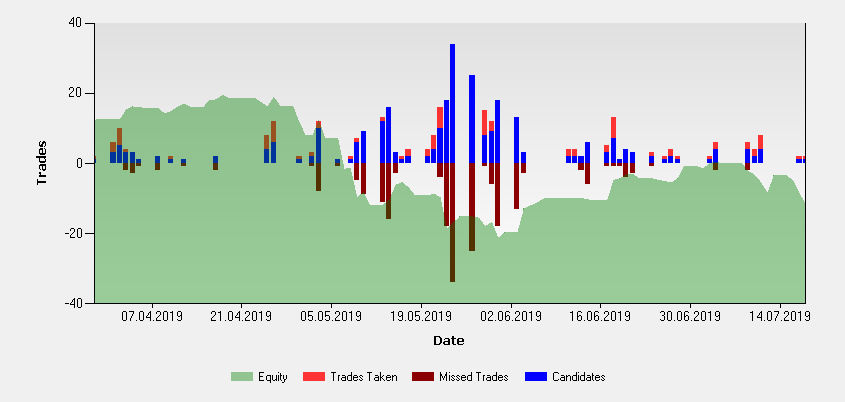 2. Winning/losing streaks with their cumulative PnL $
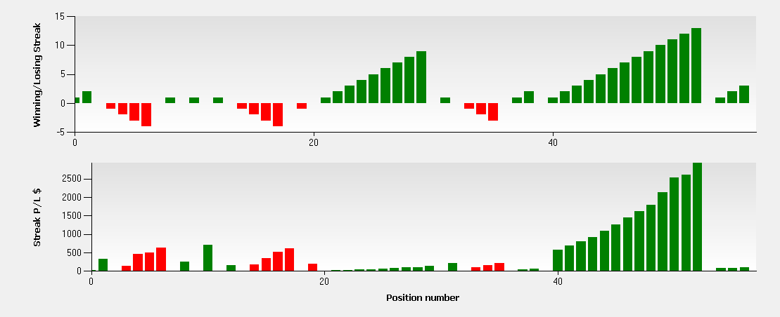
Size:
Color:
For Post# 15, please provide some documentation (a reference?) for these plots. They look interesting, but what it all means and how to use them needs some explaining. Perhaps some of the documentation can be done with Windows tool tips.
Size:
Color:
Size:
Color:
Hi Eugene,
It's look like good :-).
Why did you put the Equity curve ? For me, the Cash curve is more interesting information. If you see cash in the graph, you can define if your position sizing is made correctly. The idea is that if you have a lot of cash all the time, probably, you can increase the sizing of your trades. With the equity curve, we cannot see that.
I'm interested also to know why you haven't put the volatility of the index as an additional information ? The volatility gives you the possibility to see if you have a lot of trades because of that.
Size:
Color:
Thanks for your feedback Alexandre.
QUOTE:
Why did you put the Equity curve ? For me, the Cash curve is more interesting information.
On the ground of being universally applicable rather than single-user solution. The Equity curve meets the criterion. But I agree to expose the Cash curve too (maybe as an option) as you're making an interesting point here. Good suggestion.
QUOTE:
I'm interested also to know why you haven't put the volatility of the index as an additional information ? The volatility gives you the possibility to see if you have a lot of trades because of that.
It's arguable. In the first place, benchmark's volatility may not have direct relation to backtested portfolio's performance. At least the impact of Beta may be no greater than other technical indicators may have.
Next, many users do not define a benchmark B&H symbol in Wealth-Lab. In this case it becomes more complex to estimate volatility as the portfolio can potentially include instruments which belong to different market groups. (Note that Combination strategies may be used to backtest multiple systems applied to different DataSets comprised of instruments in different time frames - all at the same time!)
There may be even more concerns but for me it was enough to postpone, if not discard, the idea.
Size:
Color:
Thank you Eugene. Just one point : when I spoke abour volatility of the index (or the B&H curve), this is not the volality of the portfolio but the volatility of the Dataset (or Index if there is one defined in the préférence options). For this reason, I Don't see any incompatibility with Combination strategies or single / portfolio backtesting. And except if I'm wrong, I Don't see this information (volatility of the B&H / Index) in others visualizer. It't that why it could be a good add-on on this visualizer.
Size:
Color:
In this case "Portfolio" is the synonym of "DataSet" so it makes no difference to me. The volatility of a DataSet which may include different instruments is akin to gauging the average temperature of all patients in the hospital (a useless piece of statistic). It may fit some particular use case but does not look well thought and universal in the context of what I've said.
Why should it be compared to the Volatility and not some average "RSI" or even "ADX" of the portfolio's constituents? After all, trendiness may be even more predictive for some strategies and have even greater impact. It's a matter of someone's preference and applicability.
Finally, let's not overload the chart with extra readings to avoid clutter. Enough reasons for me to set it aside.
Size:
Color:
Just for your information, I make a difference between "Portfolio" and "DataSet". For me, "Dataset" is your universe of potential symbols that you select to trade with your strategy. For example, I can select the universe of symbols available in the Banks sector. In this case, you discuss on the volatility of your "Dataset in other word your market". In the other case, "Porfolio" means for me symbols that your strategy really take positions. In this case, you discuss on the volatility of your "Equity".
I agree with you that there are several formula to calculate volatility in the categories of indicators.
Size:
Color:
I experimented with it and am not convinced that the volatility of Buy & Hold (be it benchmark B&H symbol or B&H curve's own volatility) is really appropriate. We may revisit it in the future after you gain some experience with the new visualizer. Making no promises though.
Size:
Color:
Alexandre,
And again this month, new performance visualizers are added based on your requests:
1. Trade Graphs |
Streaks: plots winning/losing streaks and their cumulative profit/loss
2. Trade Graphs |
Drilldown (missed trades): evaluate the impact of trades not taken due to insufficient capital on system's equity curve
Note that the latter is zoomable and scrollable
Update MS123 Visualizers to v2019.08 and restart WLD to apply.
Size:
Color:
Thank you very much.
Size:
Color:
Thanks for sharing the details. Best wishes.
Size:
Color:
Welcome to the forums Anthony. And don't forget to start your 30-day evaluation of Wealth-Lab Developer. It's free!
Size:
Color: