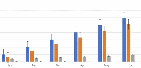
I am thinking specifically of Backtest periodic returns chart, but I think this could be applicable to any bar charts that display aggregate data. Here is an example of how it could look like:
Would it be difficult to implement?
Also, for Weekly Analysis period, would it be possible to add checkbox to allow grouping by the week number (1-52)? It might be useful to find more granular seasonal patterns.
Would it be difficult to implement?
Also, for Weekly Analysis period, would it be possible to add checkbox to allow grouping by the week number (1-52)? It might be useful to find more granular seasonal patterns.
Rename
QUOTE:
Adding error bars showing min/max values
While it's a good idea I'd say that it might make the chart look more noisy and less intuitive. Maybe as an option.
QUOTE:
Also, for Weekly Analysis period, would it be possible to add checkbox to allow grouping by the week number (1-52)? It might be useful to find more granular seasonal patterns.
I created a separate feature request for this:
https://www.wealth-lab.com/Discussion/Weekly-Analysis-group-by-week-number-7089
What are these different bars and lines displaying?
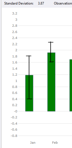
The idea is to show error bars for charts representing grouped data from periodic returns, not for regular bar chart. For grouped data (let's say monthly returns grouped by month), the current chart is (likely) showing average return value for each month of the year. I would like to add error bars showing min and max returns for each month of the year. For example, assuming that over 10 years the strategy returned 1.2 percent in January on average, with Min return of 0.4 and Max Return of 1.8, the chart would show a colored bar showing 1.2 and error bars from 1.8 to 0.1. Error bars would help to visualize the volatility of strategy returns for each month of the year
OK, understood, thanks!
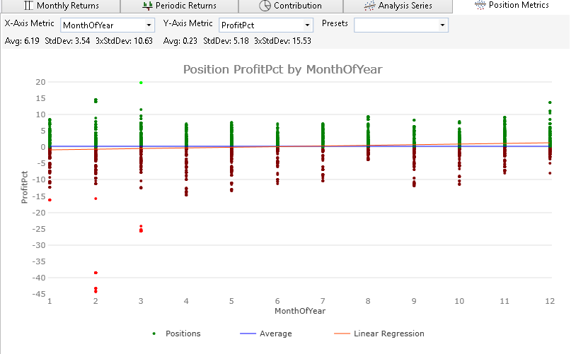
Do we really need to keep this request given that the Position Metrics tab can graph MonthOfYear by ProfitPct which provides a drilldown which is even deeper and better? Check this out:
Your Response
Post
Edit Post
Login is required